Does this logo say 91‘≠¥¥ City to you?
The City has freshened up its logo, retaining the slogan The Place to Be! but accepting that most people call it 91‘≠¥¥ City and not its formal name the City of 91‘≠¥¥.
It is worth $40,000?
According to the City, the new logo “reflects the City as it stands today and embraces its aspirations for the future: an active and vibrant urban hub with progressive residential development, growing demand as a tourist destination and place to foster small business enterprise; all while still maintaining its unique charm and character.”
The City hired consultants to delve into its uniqueness as part of a communication audit.
“The comprehensive corporate branding package included a communication audit, research and development, brand blueprint, visual identity development, a short list of potential taglines, logo, a corporate brand book, complimentary department sub-brands, corporate stationary and templates,” the City’s announcement said.
The consultants met with stakeholders and the public in 2016.
‚ÄúThe brand story elements identified were: genuine community, enriched by nature, creative vision and the most important point, the centre of 91‘≠¥¥. One of the main goals of the corporate branding project was to differentiate the City from its neighbouring municipalities by creating a new brand that will take ownership of the City‚Äôs unique offerings,‚Äù the press release said.
The new corporate logo was designed to complement the existing Coat of Arms that was designated by the Chief Herald of Canada as the City’s emblem. The Coat of Arms will still be used for official council correspondence and civic facilities.
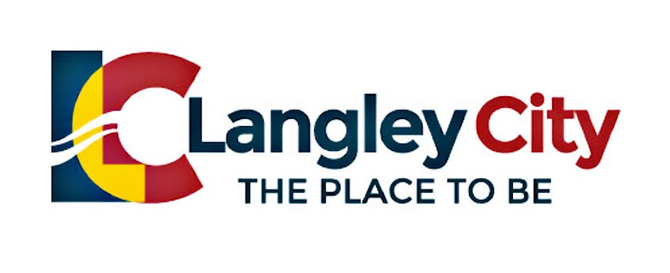
The new “LC” corporate logo was inspired by the idea to creatively rebrand the City in a simplifed way without changing the name while setting the City apart. The flowing graphical water elements that horizontally go across the “LC” represent Nicomekl River and Floodplain, one of the distinquishing geographical features unique to the City.
“Arising from this process provided us with a corporate brand book, complimentary department sub-brands, corporate stationary and templates,’ explained City administrator Francis Cheung. The entire process was around $40,000. It would be difficult to isolate to cost for the development of the logo itself because there were many steps taken as noted above that led to creation of the ‘logo’. Our best guess would be in the range of $5,000 for the logo itself.”
A municipal logo is tricky business. In early May, Vancouver City council voted to scrap its new simplified logo after taking a lot of heat from the public since it was unveiled in February.
